This week we bring you the March 2017 DIVER Geo Scores and take a look at housing at the State level. Given some of what we articulate below, expect to see a bit more on housing in the coming month.
DIVER Geo Scores are designed to quickly communicate the overall economic health of a selected geographic area on a scale of 0 to 10. The Geo Score reflects the relative economic well-being of the location and is available for all States, counties, and approximately 350 of the largest cities. Calculations are released monthly and are based on multiple, meaningful economic and demographic data from the employment, income and housing categories.
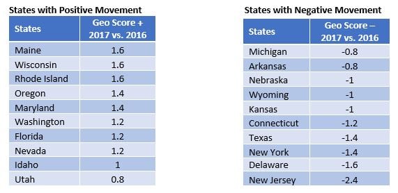
Geo Scores -- Top/Bottom Movers at the State Level
The tables below highlight those States with the largest positive and negative moves. For the top ten States that had the most significant increases in their Geo Scores, all saw flat to improving employment data, improvement in wages and an improving housing situation (prices on the upside and foreclosures on the downturn). The good news for those States with the largest decline year-over-year is that, for the most part, they saw improving data, albeit at a slower pace, with modest declines in the labor force participation rate and New Jersey, Delaware, Texas and Michigan all seeing upticks in unemployment.
As noted last month, I continue to be concerned about the housing market and suggest watching housing prices closely (once again, even those States with the most significant decline in Geo Score saw housing prices rise). For those with the view that the Fed will slow this part of the market with rate increases, I am of the view that we will get one maybe two increases if the other economic data cooperates and President Trump can pass some of his primary agenda items. Even then, I believe the Fed increases will continue to be offset by the exuberance of the moment and prices could continue to rise.
 Source: DIVER Geo Scores
Before leaving the States, look at the largest decliners – it is concerning that this list includes some big economies (including Michigan, New York, Texas and New Jersey) and a level of concentration we haven’t seen in a while.
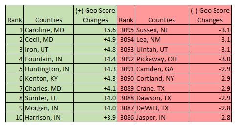
County Geo Score Movers
At the County level, those with the largest increases in their Geo Scores saw marked improvement in their employment, wage and housing situations while counties with the largest decreases in their Geo Scores saw a decline in their labor force participation rate, declining wages in seven of ten (with Cortland, NY seeing a major decline) and foreclosures on the rise in all but one county (again, all saw housing price increases).
 Source: DIVER Geo Scores
Indiana saw a concentration in counties on the move to the upside with no real pattern in the bottom movers. This further highlights the importance of looking at areas at a more granular level as opposed to lumping municipalities together based on broader geography.
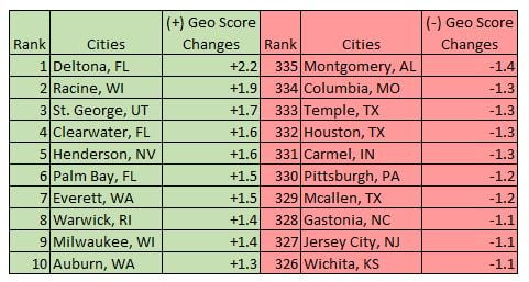
City Geo Score Movers
At the city level, the top Geo Score gainers saw marked improvement in their wage and housing data with 80% of the gainers seeing improvement in their employment data. Cities with the most pronounced decline in Geo Scores saw deteriorating employment data and higher levels of foreclosures. Please note some of the larger cities in the bottom movers. Worth keeping an eye on. While the moves are relative, they do signal a downturn in key data. The other noteworthy factor, like we discussed in both States and Counties, is that housing prices were up for all bottom movers other than Montgomery.
 Source: DIVER Geo Scores
Housing Prices -- A Closer Look
On March 29, the Wall Street Journal ran an article looking at job growth, housing inventory and higher home prices. In the article, the author pointed to a 5.7% increase in housing prices for the 20-city S&P CoreLogic Case-Schiller index. She pointed to the acceleration in the gain of home prices attributed to job growth but also suggests the same is not sustainable when wage growth is at 2.5%.
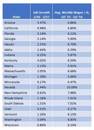
We reviewed several data points to test the conclusion (as well as our concern outlined above with regard to housing prices). Specifically, using our DIVER database, we looked at a broader set of housing data using the FHFA index over a two-year period (4Q 2014 to 4Q 2016), job growth over the last year (> 0%) and average weekly wages growing greater than 5.7% (the rate of housing price growth reported in the WSJ article). We focused on States only (although the county and city results are also worth looking at) and found 20 States that met our criteria, supporting the conclusion of the WSJ article; see below. That means 30 States and two territories do not meet the criteria that support housing price growth at the rate reported by the 20-city S&P CoreLogic Case-Schiller index.
 Source: DIVER Analytics
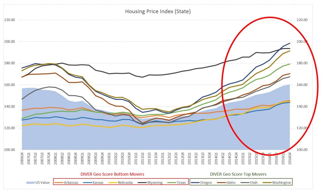
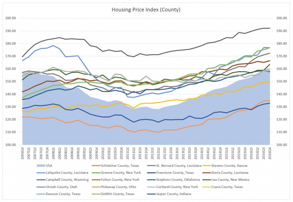
A bit more on housing prices (can you sense some concern?). With the releases of the fourth quarter FHFA Housing Price Index, we see housing prices of many States (and the US average) have returned to pre-recession levels. That’s good. Looking at the housing price trend from 2006 Q4 to 2016 Q4 among all top 10 and bottom 10 states, we see half of the bottom State movers and nearly half of top State movers have seen housing prices increases with acceleration in the price increase over the past two years. A similar observation applies to more local areas. Among the 25 bottom county movers, 18 have already recovered to the level before recession and we see an acceleration in the price increases.
 Source: Federal Housing Finance Agency
 Source: Federal Housing Finance Agency
Food for thought. Have a great week.
Jane Ma and Gregg Bienstock